Imagine you search something on Google, click a result, and in one second you think, “Nope.” You didn’t even read the words—you just felt like the page was hard to look at. That feeling is exactly where color and SEO secretly shake hands.
Not in the simple “Google ranks red websites higher than blue ones” way. Google doesn’t look at your site and go, “Ooo, nice purple, page one!” But color can affect the things that do influence SEO, like whether people stay, click, read, and trust your website. In other words: color usually affects SEO indirectly by affecting humans. And humans affect SEO.
If you’re building in Webflow and want the bigger picture of getting a site ready to rank, these two posts pair really well with what you’re about to read:
Webflow SEO Best Practices: A Step-by-Step Setup for Template Buyers and
Mastering SEO for Your Webflow Templates.
SEO (Search Engine Optimization) is basically “helping your website show up when people search.” Google tries to give searchers the best result. That usually means helpful content, fast loading, and a good experience on the page. Color is part of that “experience.”
Google’s main job is to match a search with a useful page. It looks at things like your content, your page speed, your mobile friendliness, and lots of other signals. Color isn’t a direct ranking factor you can toggle on or off like “add a keyword.”
But color changes what people do when they land on your site. Do they leave right away? Do they scroll? Do they click your buttons? Do they feel comfortable reading? If your color choices make your site confusing or unpleasant, people may bounce (leave quickly). If people love your site, they stick around, share it, and come back. Those outcomes can help your SEO.
Think of it like a restaurant. The food matters most, but if the lights are so bright that it hurts your eyes, you might leave before dessert. Color is like the lighting and décor of a website. It helps people feel like they’re in the right place.
Before someone even reaches your page, they usually see it in search results. Color can still matter here—especially if your brand colors show up in your favicon (the tiny icon in the browser tab), your social previews, or your title images if Google displays them.
More often, color matters right after the click. If your site looks trustworthy and easy to use, people think, “Okay, this seems legit.” If it looks messy or harsh, they may hit back and choose a different result.
You can’t force people to click you in Google with color alone, but you can make sure that once they click, they feel good instantly—and that helps.
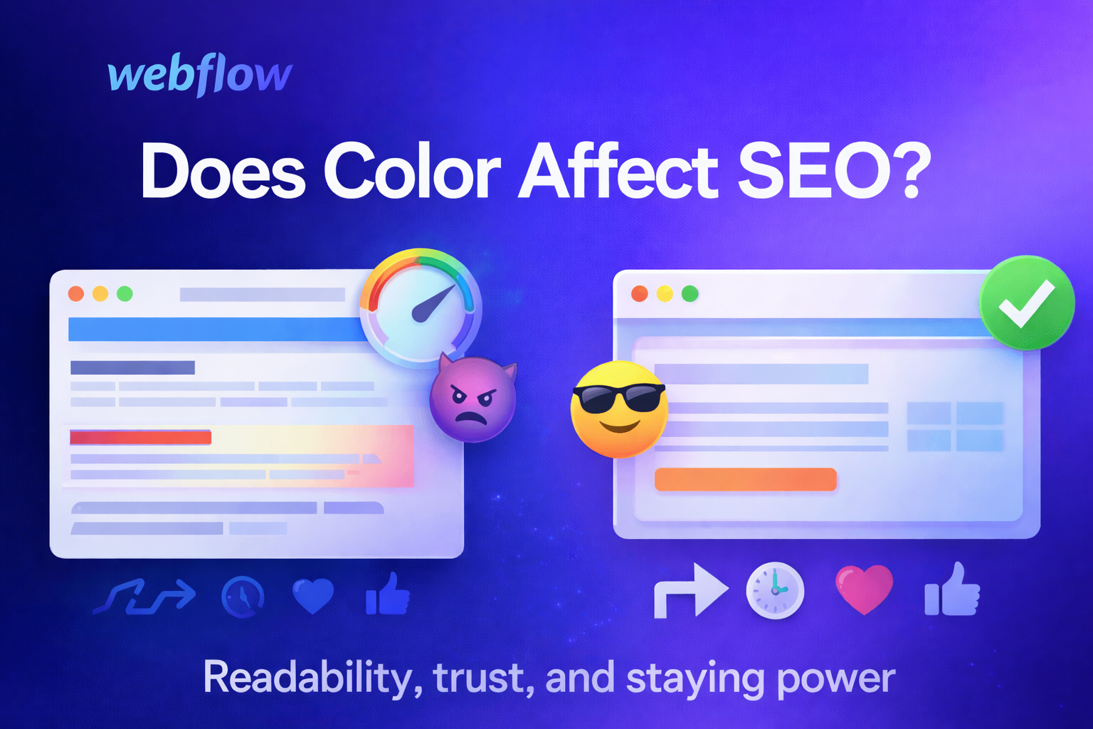
This one is huge. Let’s say your blog post is actually amazing. But the text is light gray on a white background, or neon green on black, or the background has a busy pattern behind the words. People’s eyes get tired fast. They stop reading. They don’t finish. They don’t share. They leave.
Good SEO content has to be readable. Color contrast—how different the text color is from the background—makes reading easier. Most of the time, plain dark text on a light background is easiest for long reading.
Some SEO people argue about how much Google uses “user signals” like time on page or bounce rate directly. You don’t need to know the debate to understand the real point: if your site is annoying, people leave. If your site is comfortable, people stay. Staying leads to better outcomes—more reading, more links, more sharing, more trust.
Color is part of comfort. Soft backgrounds, clear text, and calm, consistent accents can make people feel relaxed. Too many bright colors, too many clashing tones, or confusing highlights can make the page feel stressful or messy.
SEO is not only about ranking—it’s also about what happens after people arrive. Google likes pages that solve the user’s problem. Color can guide people through the page so they can actually get the answer.
For example, good color use can:
When people can find what they need quickly, they’re happier. Happy visitors are more likely to stay, share, and come back.
If your site is selling something (templates, services, products), color and layout choices can also affect conversions. This is a great related read:
10 Online Store Design Mistakes to Avoid for Higher Sales.
You can usually tell if a website feels professional within a couple of seconds. Color plays a big role in that. A clean, consistent color palette makes a site look like it belongs to a real business or a serious creator. Random colors everywhere can make a site feel spammy, even if the content is fine.
Trust matters for SEO in a few ways. If people trust you, they may link to you. They may mention you. They may search your brand name later. They may return and spend more time reading. Links and brand searches are both strong SEO signals. So while color isn’t “SEO code,” it can help you earn the kind of trust that leads to the signals Google does care about.
If you’re picking a template style and want ideas for different “trust vibes,” these posts can help you think through what fits your audience:
Best Webflow Templates of 2024: Elevate Your Online Presence and
Premier Webflow Portfolio Templates for 2023 Year.
A common mistake is using color alone to communicate information. Like: “Click the green button” or “Required fields are marked in red.” That’s not great for people who are color-blind or have trouble seeing color differences.
A better way is to use color and another cue, like an icon, underline, bold text, or a label. For example, error messages can be red and include an exclamation icon and a clear message like “Please enter your email.”
Accessible design helps more people use your site easily. That means a bigger audience can read your content, interact with it, and share it. And that’s good for SEO.
If you build sites for specific causes (like community orgs), clarity and accessibility matter even more. This one fits nicely here:
Top Webflow Templates for Non-Profit & Charity Websites.
Color itself doesn’t slow down a website. But some color-related design decisions can. For example, if you use huge background images, heavy gradients, or large decorative graphics just to get a certain look, those files might slow down your page.
Speed matters for SEO because Google wants to send people to pages that load quickly, especially on phones. If your site is slow, visitors get impatient and leave. So it’s smart to choose a design style that looks good without needing giant files.
If you love colorful design, you can still do it in a lightweight way—using CSS colors, simple shapes, optimized images, and not overloading the page with heavy visuals.
There isn’t one magic SEO color. What matters is whether your colors help people:
That said, there are some practical guidelines that usually work well.
Use a limited color palette. Pick a main color (your brand color), a secondary color, and a couple of neutrals (like white, black, gray, beige). Too many colors can look chaotic, and chaos makes people leave.
Make text easy to read. Dark text on a light background is the simplest choice for blog posts. If you want dark mode, use soft off-white text on a dark background (not pure white on pure black, which can feel harsh).
Use one clear accent color for actions. Buttons, links, and highlights should feel consistent. If everything is highlighted, nothing is highlighted.
Check your contrast. If your headings or buttons blend into the background, people miss them. If they pop too much, it can feel aggressive. Aim for clear but not painful.
Don’t rely on color alone. Use icons, labels, spacing, and underlines (especially for links) so everyone understands your page.
Keep it consistent across pages. If your “Subscribe” button is blue on one page and orange on another, people get confused. Consistency builds trust.
Test on phones. Colors can look different on small screens, and bright colors can feel extra intense. Also, sunlight can wash out pale text. Make sure your mobile design is readable.
Let’s say you run a blog about baking. Your content is awesome, but your background is bright yellow and your text is white. It looks fun, but it’s hard to read. People click, squint, then leave. Over time, your posts don’t get shared as much, and other sites don’t link to you, because visitors aren’t staying long enough to appreciate your work.
Now imagine you switch to a clean white or soft cream background, dark text, and you keep that bright yellow as a highlight color for headings or buttons. Same personality, way easier to read. People stay longer. They share more. More shares and links can help you build authority, which can lead to better rankings.
That’s color affecting SEO—through people.
Color doesn’t directly tell Google where to rank your website. But color can strongly affect the user experience, and the user experience can affect the results you get from SEO. If your site is easy to read, looks trustworthy, guides visitors clearly, and loads quickly, you’re setting yourself up for better performance.
So yes—color can affect SEO, just not in a “Google loves blue” way. It affects SEO in the way that matters most: it affects whether humans enjoy your site.
If you want to go deeper on the Webflow side of building and optimizing sites (beyond color), you might also like:
Are Webflow Developers in Demand in 2025? and
Supercharge Your SaaS Business with Webflow Templates.
Join for design inspiration, new templates, and creative tips to help you build smarter, faster.